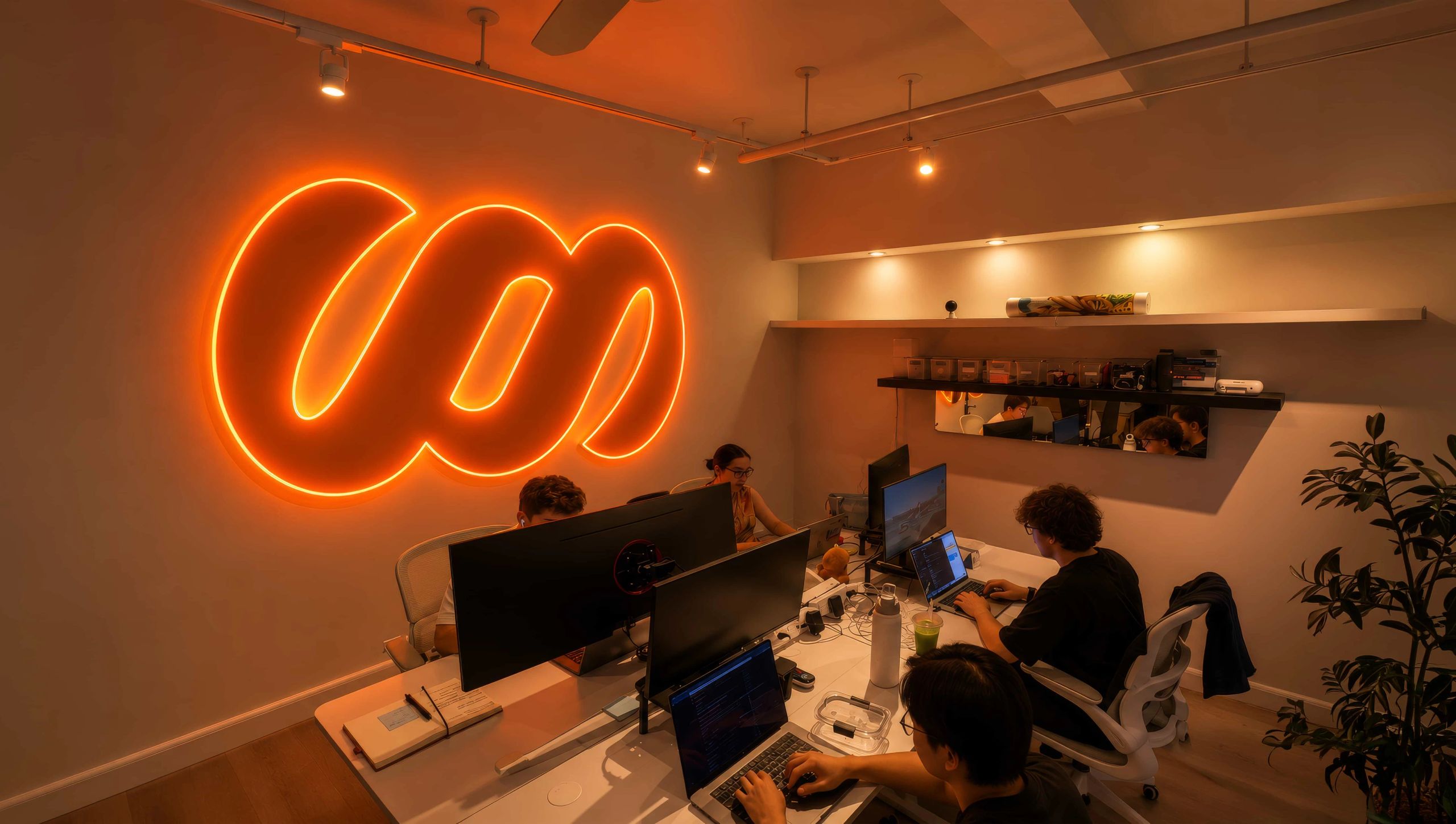
When a company is growing, a new logo can feel like the obvious next step. It's visible, it's easy to announce, and it signals that something has changed. But when a mark already has equity, and nothing is really wrong with the mark or the company, there's no reason to replace it.
We worked through this with SWSH, an app where fans collect and revisit shared albums from concerts, festivals and live shows. It came down to five decisions.
Start with what the mark already does
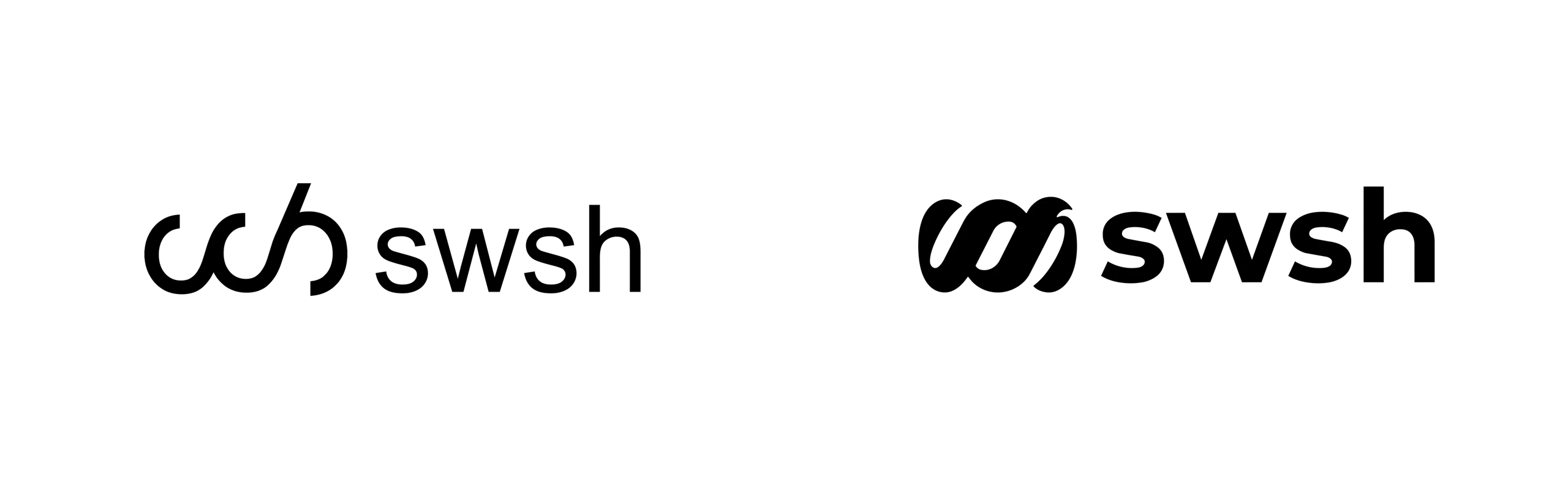
SWSH had explored another logo, and it didn't feel like SWSH.
Before recommending anything, we asked what a new logo was meant to achieve, and how the existing mark compared. The answers came down to fit. SWSH's interlocking icon was already in market, on the app, the website, festival signage and partner decks. Its most important jobs were small ones: an app icon, a round social avatar, a sign seen across a crowd. Replacing it would have spent the recognition SWSH had built, in exactly the places it mattered most.
There was no need to change a mark with equity
So I told them to keep it. The idea behind the icon, three interlocked loops that suggest motion and shared moments, was right for a social product built around live events. What the mark needed was tighter execution.
A lot of design is change for the sake of change. A big change makes news, and it makes a client feel they got a lot. A small change is a harder sell. It takes courage to recommend, and real work to do well.
Weeks on the icon alone
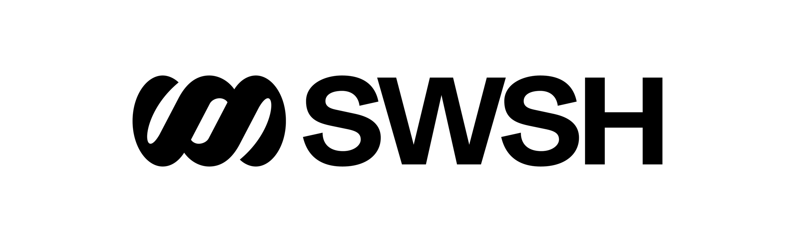
We spent weeks on the SWSH icon by itself. The logo refresh tightened its geometry and kept its familiar interlocking forms. Its rotational symmetry keeps it recognizable as a pin or sticker turns, and it fills a square or round frame for the app icon and social profiles. A small change doesn't mean the work was minimal.
One name, written one way
Before the project, the name appeared three ways. Investors and outsiders mostly wrote SWSH. The company's LinkedIn page used swsh. Sometimes it was Swsh.
We made the case for all caps, and SWSH agreed. SWSH simply looks stronger in caps, and a lot of small reasons added up behind that. In caps it sits at the same height as the icon, so the two align as one signature, compact enough for an event wristband. In a sentence, it reads as a name instead of an unfamiliar word or a typo, and it holds its place in a headline. It's also how many people were already writing it. And it makes sense, because SWSH stands for something: Somewhere Somehow. As I put it when it launched, "We made SWSH more SWSH than ever before."
A system that lets SWSH share the stage
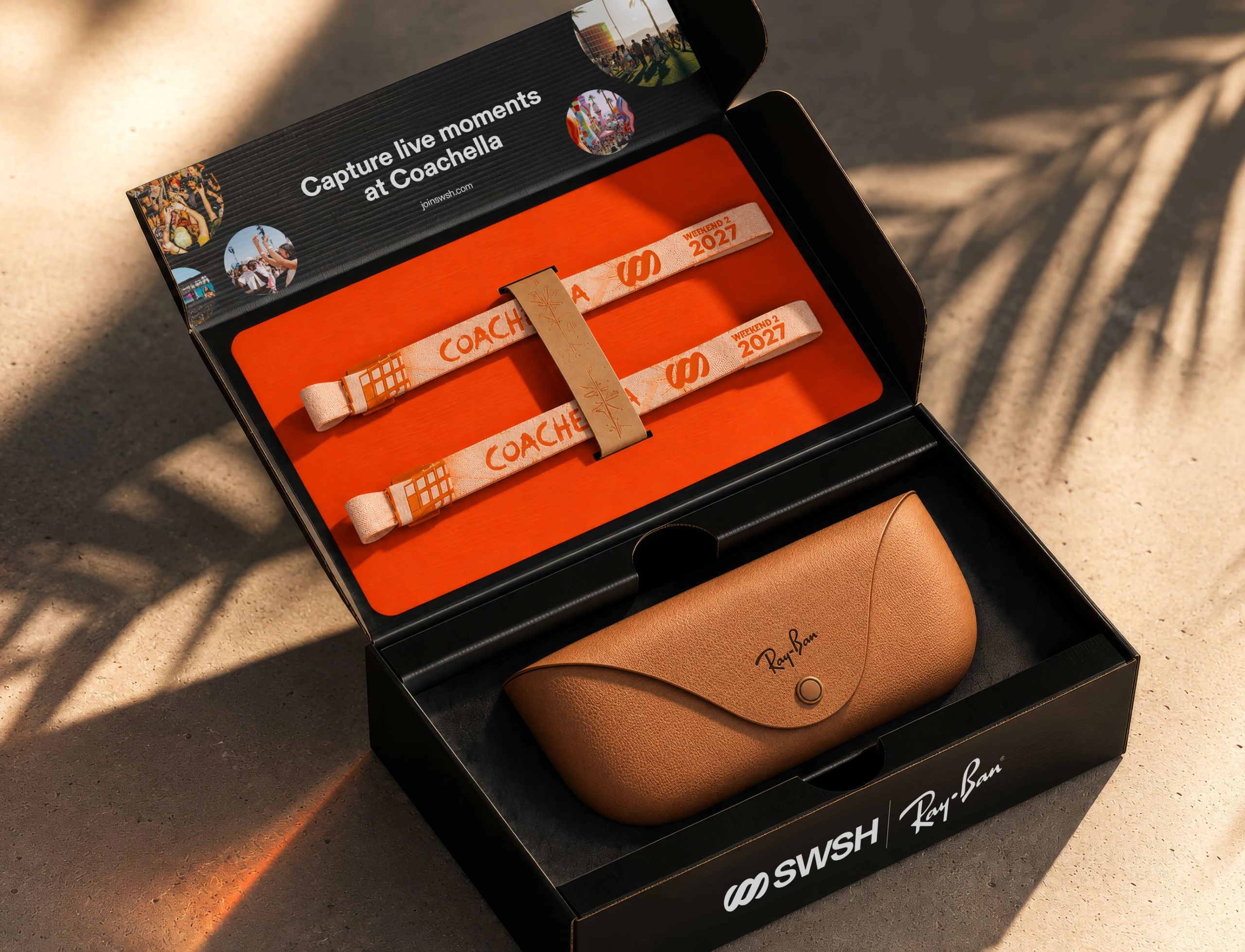
SWSH appears next to artists, venues and partners, so the identity steps back on purpose. The frame is black and white, and the event photography supplies the color. Partner pairings use a separate divider line, and sub-brands extend the wordmark with a lighter-weight descriptor.
We designed the system for wristbands, pins, stickers, transit ads and stage screens.
My partner Kyrylo Orlov built the website in-house at SWSH, on the brand direction we set. "Our starting point was the new identity and logo," Kyrylo wrote. Kyrylo's website has since earned an Awwwards Honorable Mention and four CSS Design Awards (Special Kudos, plus UI Design, UX Design and Innovation) in September 2026. Brand New featured the identity in its Spotted section on Oct 15, 2026.
Weilyn Chong, SWSH's co-founder and COO: "It still feels familiar to our customers… Jonathan and New Studio Partners moved fast without compromising quality."
The same question applies to any company that's growing into its next stage: what has the current mark already earned? We start with the questions we ask every client. What are your goals? What's changing? What do you want to achieve?
If your brand is at that kind of turning point, let's talk.
Frequently asked questions
Should I redesign my logo?
Not unless something is actually wrong with it. If people already recognize your mark and the business hasn't fundamentally changed, that recognition is worth protecting. Redesign when the idea behind the mark is wrong. Refresh it when the idea is right but the execution isn't.
What's the difference between a logo refresh and a redesign?
A redesign replaces the mark with a new idea. A refresh keeps the idea people know and redraws it with better geometry, proportions and spacing, so it works at every size. The change can look small. The work behind it isn't.
How do you know if a logo has equity?
Look at where people already see it and whether they recognize it there: the app icon, the avatar, the sign at the venue. If the mark identifies the company in the places that matter, and the idea behind it still fits, that recognition is equity worth keeping.